Learn how to build an AI business dashboard for operations, KPI monitoring, and reporting automation — using just prompts, no coding required.
Introduction
Most business teams are drowning in data but starving for clarity. Sales numbers live in one spreadsheet, HR metrics in another, and operational KPIs buried inside tools no one checks consistently. The result? Decisions get made on gut feel instead of real-time insight.
An AI business dashboard changes that. Instead of spending hours pulling reports and formatting data manually, you describe what you want — and AI builds it for you. No developer needed, no complex BI setup, no waiting weeks for IT to deliver a solution.
This guide is for corporate teams, HR departments, startups, and operations managers who want a working AI analytics dashboard without the technical overhead. You’ll learn which platforms let you build entirely through prompts, how to set up your first dashboard in under an hour, and how to connect it to the data that actually drives your business.
Quick Summary
- AI dashboards let you visualize KPIs, automate reporting, and monitor operations — built through natural language prompts.
- The best platforms for prompt-only dashboard creation include Bolt.new, Lovable, Retool AI, and Rows.
- No coding experience is required for most use cases.
- Setup can be completed in a single session, often under an hour.
- Works for startups, corporate teams, HR, marketing, and operations equally well.
Table of Contents
- What You’ll Learn
- Why AI Dashboards Matter for Business Operations
- Tool Overview: Best Platforms for AI Dashboard Creation
- Step-by-Step: Build Your AI Business Dashboard
- Workflow Diagram
- How Businesses Use AI Dashboards
- Best Practices
- Common Mistakes to Avoid
- Alternatives Worth Considering
- FAQ
- Key Takeaways
What You’ll Learn
- What makes an AI dashboard different from a traditional BI tool
- Which platforms let you build a full operational dashboard using only prompts
- A simple, low-setup process to get your first dashboard live fast
- Real business use cases across teams and industries
- How to connect live data without complex integrations
- What to avoid so your dashboard actually gets used
Why AI Dashboards Matter for Business Operations
Traditional business intelligence tools — Tableau, Power BI, Looker — are powerful, but they come with a steep learning curve, long implementation timelines, and a dependency on data analysts or IT teams.
AI dashboard tools flip this dynamic. You describe the metrics you want to track, the layout you prefer, and the data source you’re working from — and the platform builds it. Iteration is just another message.
The business impact is immediate:
- Faster decisions when KPIs are visible at a glance
- Less manual reporting for managers and team leads
- Greater team alignment when everyone sees the same live data
- Lower cost compared to enterprise BI implementations
- No backlog dependency — teams build what they need, when they need it
For HR departments tracking headcount and attrition, operations teams monitoring fulfillment metrics, or startups watching activation and churn — an AI analytics dashboard built in hours beats a six-week BI project every time.
Tool Overview: Best Platforms for AI Dashboard Creation
These platforms were selected specifically because they support prompt-first, low-setup dashboard building. You describe what you want — they build it.
Bolt.new
Bolt.new is a browser-based AI development platform that generates full-stack web applications from natural language. For dashboards, it’s particularly strong: describe your metrics, your data structure, and your preferred layout, and it produces a working, interactive dashboard with charts, tables, and filters.
Key Features:
- Full dashboard UI generated from a single prompt
- Supports chart types: bar, line, pie, KPI cards, tables
- Connect to APIs or paste in CSV/JSON data
- One-click deploy to a shareable URL
- No local setup — runs entirely in the browser
Best for: Teams that want a fully custom dashboard deployed fast, without touching code.
Official Website: https://bolt.new
Lovable
Lovable builds complete web applications from conversational prompts. Its strength is in iterative refinement — you describe a dashboard, review it, then keep refining through chat until it’s exactly right. Supabase integration means you can connect real database tables directly.
Key Features:
- Conversational dashboard building and editing
- Native Supabase backend for live data
- GitHub export for version control
- Clean, modern UI output by default
Best for: Teams that need a dashboard connected to a live database, built and iterated without writing code.
Official Website: https://lovable.dev
Rows
Rows is an AI-powered spreadsheet that doubles as a dashboard builder. It can pull live data from APIs (Google Analytics, Stripe, Hubspot, etc.), run AI analysis on that data, and display it in clean, shareable dashboard views — all from a spreadsheet-like interface.
Key Features:
- 50+ native integrations (Stripe, GA4, HubSpot, Salesforce, etc.)
- AI-generated charts and summaries from your data
- Shareable, embeddable dashboard views
- Familiar spreadsheet interface — no learning curve
Best for: Operations and finance teams who live in spreadsheets and want to add live data and AI insights without leaving that environment.
Official Website: https://rows.com
Retool
Retool is a low-code internal tool builder with a strong AI layer. It connects to databases, APIs, and SaaS tools, and lets you build dashboards and operational tools through a drag-and-drop interface with AI assistance for query generation and component setup.
Key Features:
- Native connections to 100+ data sources
- AI-assisted SQL query generation
- Rich component library (charts, tables, forms, KPI tiles)
- Role-based access control for team dashboards
Best for: Operations and engineering teams that need dashboards connected to multiple data sources with fine-grained control.
Official Website: https://retool.com
Official Documentation: https://docs.retool.com
Step-by-Step: Build Your AI Business Dashboard
Step 1: Define the 5 Metrics That Matter Most
Why it matters: A dashboard with 30 metrics is just noise in a different format. The most effective operational dashboards are focused. Start with the five numbers that, if wrong, would require immediate action from your team.
What to do: Write down your top five KPIs. For each one, note:
- What it measures
- Where the data lives (spreadsheet, database, SaaS tool)
- How often it should update (daily, weekly, real-time)
Example for an operations team:
- Orders fulfilled per day
- Average fulfillment time
- Support tickets open vs. resolved
- Team utilization rate
- Weekly revenue vs. target
Expected result: A clear one-page brief you can paste directly into an AI prompt. This step alone makes everything that follows faster and more accurate.
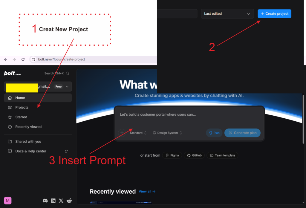
Step 2: Choose Your Platform Based on Where Your Data Lives
 Create-AI-Dashboards-for-Business-Operations-Without-Writing-Code-Bolt-AI-1024x552.png" alt="How to Create AI Dashboards for Business Operations Without Writing Code - Bolt AI" width="1024" height="552" />
Why it matters: The best dashboard tool for you depends less on features and more on where your data already is. Picking the right platform upfront avoids integration headaches later.
What to do: Match your data source to the right tool:
- Data is in a Google Sheet or CSV → Use Rows or Bolt.new (paste data directly)
- Data is in a database (PostgreSQL, MySQL, Supabase) → Use Lovable or Retool
- Data is in SaaS tools (HubSpot, Stripe, GA4) → Use Rows (native integrations)
- You want a fully custom UI deployed as a web app → Use Bolt.new or Lovable
Expected result: A platform selected and an account created — ready to start building.
Okay now let’s create an AI Dashboards system for Business Operations with Bolt New AI.
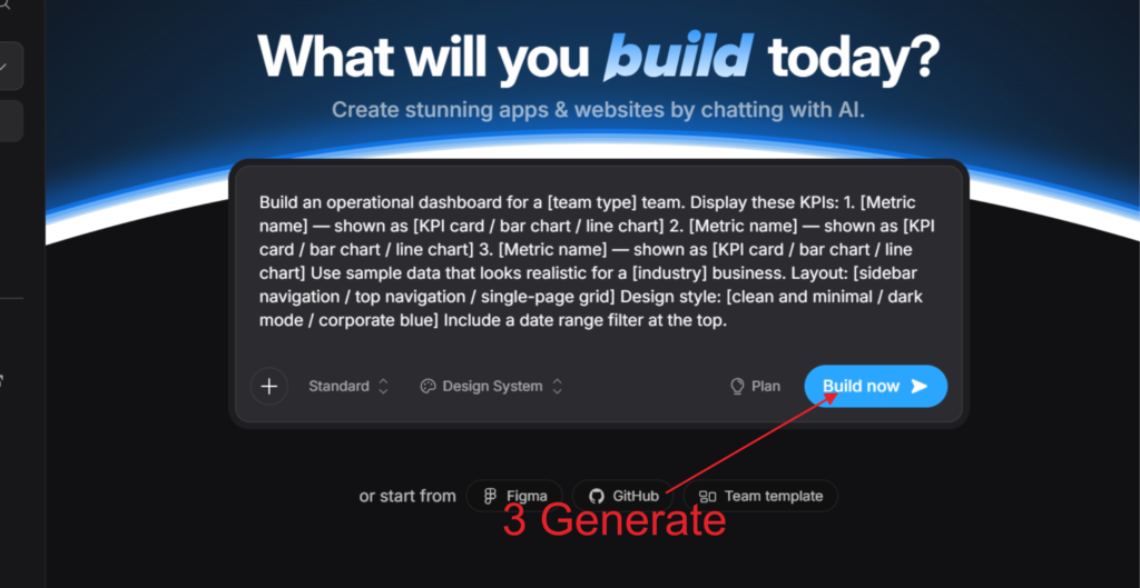
Step 3: Write Your Dashboard Prompt
Why it matters: This is the step most people underinvest in. A well-structured prompt produces a dashboard you can actually use. A vague prompt produces a generic template you’ll spend hours fixing.
What to do: Use this prompt structure in Bolt.new or Lovable:
Build an operational dashboard for a [team type] team.

Display these KPIs:
1. [Metric name] — shown as [KPI card / bar chart / line chart]
2. [Metric name] — shown as [KPI card / bar chart / line chart]
3. [Metric name] — shown as [KPI card / bar chart / line chart]

Use sample data that looks realistic for a [industry] business.
Layout: [sidebar navigation / top navigation / single-page grid]
Design style: [clean and minimal / dark mode / corporate blue]
Include a date range filter at the top.
The more specific you are about chart types, layout, and design, the less iteration you’ll need afterward.
Expected result: A fully rendered dashboard UI with all five KPIs displayed in your preferred format, using realistic sample data.
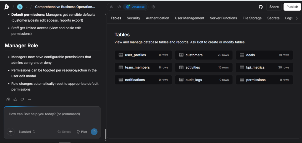
Step 4: Replace Sample Data with Real Data
Why it matters: A dashboard running on sample data is a prototype. A dashboard running on your real numbers is an operational tool. This step is what makes it actually useful.
What to do — pick the method that matches your setup:
Option A — CSV/Spreadsheet data: Export your data as a CSV, then ask the AI: “Replace the sample data with this CSV file — keep the same chart layout.” Paste or upload the file.
Option B — API or live integration: In Rows, connect your data source from the integrations panel (e.g., connect Stripe for revenue data). The dashboard updates automatically on schedule.
Option C — Supabase database (Lovable): Link your Lovable project to a Supabase table. Ask: “Connect the [metric name] chart to the [table name] table in my Supabase database.”
Expected result: Your dashboard now displays real business data. KPI cards show actual numbers, charts reflect real trends, and the data updates on whatever schedule you’ve configured.
Step 5: Deploy and Share with Your Team
Why it matters: A dashboard that only you can see isn’t an operational tool — it’s a personal report. The goal is to make key metrics visible to the right people without requiring them to log into another tool.
What to do:
- Bolt.new: Click Deploy → get a shareable URL. Bookmark it in your team’s Slack channel or internal wiki.
- Lovable: Publish the project → share the live URL.
- Rows: Click Share → generate a view-only dashboard link.
- Retool: Set permissions by role → share via your organization’s SSO.
For sensitive operational data, make sure to set access controls before sharing widely.
Expected result: A live URL your team can bookmark and check daily — no login required for view-only access in most platforms.
Tutorial Video
How Businesses Use AI Dashboards
Startups
Founders use operational dashboards to track activation, retention, and revenue metrics in one place — without paying for enterprise analytics tools. A single Bolt.new or Rows dashboard often replaces three different SaaS subscriptions.
Agencies
Account managers build client-facing dashboards that display campaign performance, lead volume, and conversion rates. Instead of weekly PDF reports, clients get a live URL they can check anytime.
Marketing Teams
Marketing teams track campaign KPIs — impressions, clicks, cost per lead, conversion rate — across channels in a single view. Rows integrates directly with Google Analytics 4 and ad platforms, making this setup particularly fast.
HR Departments
HR teams monitor headcount, open roles, time-to-hire, attrition rate, and employee satisfaction scores. An AI dashboard built in Lovable or Retool replaces manual monthly HR reports and gives leadership real-time visibility.
Operations Teams
Operations teams track fulfillment rates, SLA compliance, inventory levels, and support queue health. These dashboards often pull from multiple sources — which makes Retool or Rows the right fit.
Enterprise Innovation Teams
Large organizations use AI dashboard tools in internal hackathons and innovation sprints to prototype reporting solutions quickly — then hand off to IT for formal implementation if the concept proves valuable.
Creators and Solopreneurs
Individual creators track newsletter growth, revenue, and audience metrics across platforms. A simple Rows dashboard pulling from ConvertKit, Stripe, and Twitter APIs gives a clearer picture than checking each platform separately.
Best Practices
Keep it to one screen. The most effective dashboards don’t require scrolling. If your KPIs don’t fit on one screen, you’re tracking too many things. Prioritize ruthlessly.
Name your metrics in plain language. “MQL → SQL Conversion Rate” means nothing to an operations manager. “Leads that became sales conversations” does. Label for your audience, not for precision.
Add a date range filter from the start. Every operational dashboard needs the ability to filter by time period. Build this in during the prompt phase — retrofitting it later adds unnecessary iteration.
Refresh data on a schedule that matches how decisions are made. A daily operations standup needs yesterday’s data. A weekly executive review needs last week’s. Don’t default to real-time if daily is sufficient — it adds complexity without adding value.
Share the dashboard before it’s perfect. Early feedback from actual users is more valuable than an extra week of refinement. Get it in front of your team fast and iterate based on what they actually use.
Build one dashboard per team, not one dashboard for everyone. An HR dashboard and a sales dashboard have almost nothing in common. Resist the urge to consolidate — focused dashboards get used; universal dashboards get ignored.
Common Mistakes to Avoid
Tracking vanity metrics. Page views, social followers, app downloads — these feel meaningful but rarely drive decisions. Build dashboards around metrics that change behavior when they move.
Connecting too many data sources at once. Start with one data source, get the dashboard working, then add integrations one at a time. Trying to connect everything in the first session leads to broken queries and abandoned projects.
Skipping the access control step. Sharing a dashboard with sensitive financial or HR data via an open URL is a real security risk. Set access permissions before distributing any link externally.
Building for presentation instead of daily use. A beautiful dashboard that requires 20 minutes to interpret every morning isn’t operational — it’s decorative. Prioritize clarity and speed of comprehension over visual complexity.
Rebuilding from scratch every time something changes. The best AI dashboard tools support iterative editing through chat. When a metric changes or you need a new chart, ask the AI to update it rather than starting over.
Not testing on mobile. Many team members will check dashboards on their phones. Deploy and test on a mobile screen before sharing — what looks clean on a desktop often breaks on a smaller viewport.
FAQ
What is an AI business dashboard? An AI business dashboard is a data visualization tool where AI handles the design, layout, and setup based on your natural language description. Unlike traditional BI tools that require manual configuration, you describe the metrics and charts you want, and the platform builds them for you.
Do I need to know SQL or coding to build an AI dashboard? No. Platforms like Bolt.new, Lovable, and Rows are designed specifically for non-technical users. You describe what you want in plain language, and the AI handles the technical implementation. For more advanced data connections, some familiarity with how databases work helps, but it’s not required.
How long does it take to build an AI analytics dashboard? For a focused five-metric dashboard using sample or CSV data, most users complete the full process — from prompt to deployed URL — in under an hour. Connecting live data sources and refining the design typically adds another hour or two.
What’s the best AI dashboard tool for small businesses? Rows is an excellent starting point for small businesses because it connects directly to tools they’re already using (Stripe, Google Analytics, HubSpot) and doesn’t require any technical setup. Bolt.new is the better choice when you need a fully custom layout.
Can AI dashboards update automatically with live data? Yes. Platforms like Rows and Retool support scheduled data refresh, pulling updated numbers from connected APIs or databases automatically. Bolt.new and Lovable can also display live data when connected to a real backend like Supabase.
How is an AI dashboard different from Google Looker Studio? Looker Studio is a traditional BI tool that requires manual chart configuration and data source setup. AI dashboard builders let you describe the entire dashboard in plain language and generate it automatically. Looker Studio offers more customization at scale; AI builders offer dramatically faster setup for most business use cases.
Are AI-generated dashboards secure enough for business data? They can be, with the right setup. Platforms like Retool offer enterprise-grade security, SSO, and role-based access control. For platforms like Bolt.new, security depends on how you configure the backend. Always review data access permissions before sharing dashboards that contain sensitive information.
Alternatives Worth Considering
Google Looker Studio
What it does: Free BI tool from Google that connects to Google Analytics, Google Sheets, BigQuery, and hundreds of other sources via community connectors. Produces shareable, interactive reports. When it’s better: When your data is already in the Google ecosystem and you need a free, reliable solution with strong sharing controls. Best for: Marketing teams and small businesses already using Google Workspace. Official Website: https://lookerstudio.google.com
Metabase
What it does: Open-source business intelligence tool that connects to databases and lets teams create dashboards and run queries without SQL expertise. When it’s better: When you have a database backend and need a self-hosted, privacy-forward dashboard solution. Best for: Engineering-led teams and companies with data privacy requirements. Official Website: https://metabase.com
Notion + AI
What it does: Notion’s database and AI features can create simple internal dashboards by combining linked databases, filtered views, and AI-generated summaries. When it’s better: When your team already lives in Notion and needs lightweight KPI visibility alongside documentation — not a dedicated analytics tool. Best for: Early-stage startups that want to avoid adding another tool to their stack. Official Website: https://notion.so
Glide
What it does: Builds data-driven apps and dashboards from Google Sheets or Airtable, with a clean mobile-first interface and no coding required. When it’s better: When your data lives in a spreadsheet and you need a dashboard that works well on mobile devices. Best for: Field teams and operations managers who need mobile-friendly access to operational data. Official Website: https://glideapps.com
Key Takeaways
- AI business dashboards eliminate the gap between having data and actually using it — built through prompts, not code.
- The fastest path to a working dashboard: define your top 5 KPIs, write a structured prompt, and deploy in a single session.
- Bolt.new and Lovable are best for fully custom dashboards. Rows is best when your data is already in SaaS tools. Retool is best for multi-source enterprise setups.
- Real value comes when the dashboard runs on live data — take the extra step to connect your actual data source.
- Keep dashboards focused: one team, one screen, five metrics. Simplicity drives consistent use.
- AI dashboard tools don’t replace BI for complex analytics — but for operational visibility and KPI monitoring, they’re faster, cheaper, and good enough for most business decisions.
- Deploy early, share with your team, and iterate based on what actually gets checked — not what looks impressive in a demo.