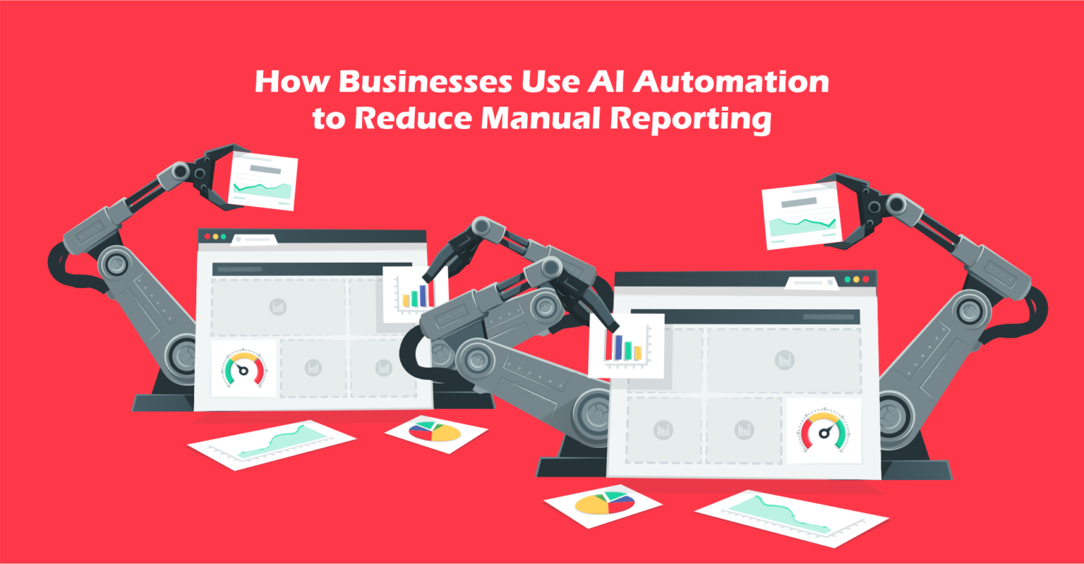
Learn how AI reporting automation eliminates manual reporting work. A practical guide to automated dashboards, business analytics AI, and workflow automation for teams.
Introduction
Most business teams spend more time collecting data than acting on it. A marketing manager pulls numbers from Google Analytics, copies them into a spreadsheet, formats a chart, and sends it to the team — every single Monday morning. A finance team spends two days each month pulling figures from five different systems, reconciling them in Excel, and producing a report that is already out of date by the time anyone reads it. An HR team manually compiles headcount, turnover, and recruitment metrics into a slide deck for the quarterly leadership review.
This is not reporting. This is data assembly — a manual, repetitive process that consumes skilled people’s time and produces information that is always slightly late.
AI reporting automation exists to replace this cycle. By connecting your data sources, automating the collection and transformation of data, and generating reports and dashboards on a schedule — or in real time — businesses eliminate the manual assembly work entirely and give teams access to current, accurate information without anyone having to build it.
This guide is written for business analysts, operations managers, marketing leads, HR directors, startup founders, and corporate teams who want a practical, step-by-step understanding of how to automate reports using AI-powered tools — starting with a workflow they can build and launch this week.
By the end, you will know how AI dashboard workflow tools work, which steps in your current reporting process can be automated first, and how to build a simple automated reporting system using Google Looker Studio connected to live data sources.
Quick Summary
- Manual reporting is a hidden time drain — most teams spend 4–8 hours per week assembling reports that could be automated.
- AI reporting automation connects your data sources, transforms the data, and generates reports or dashboards automatically on a schedule or in real time.
- The most impactful reports to automate first are the ones produced most frequently — weekly performance reports, monthly KPI dashboards, and recurring management summaries.
- Google Looker Studio (free) connected to live data sources is the most accessible entry point for business analytics AI without technical skills.
- AI tools like ChatGPT (via Zapier or Make) can generate written narrative summaries from data automatically, eliminating the commentary-writing step.
- Teams that automate their core reporting workflows typically reclaim 3–6 hours per week per person who was previously assembling reports manually.
Table of Contents
- What You’ll Learn
- Why Manual Reporting Is Holding Your Team Back
- Tool Overview: Google Looker Studio for AI Dashboard Workflows
- Step-by-Step Tutorial: Build Your First Automated Report
- Tutorial Video:
- How Businesses Use AI Reporting Automation
- Best Practices for Automated Reporting
- Common Mistakes in Report Automation
- FAQ
- Alternative Reporting Automation Tools
- Key Takeaways
- Conclusion
What You’ll Learn
- Why manual reporting wastes more time than most managers realize
- How to identify which of your current reports are the best candidates for automation
- How to connect live data sources to a reporting dashboard without writing code
- How to set up automatic report delivery on a schedule via email
- How to add an AI narrative layer that writes the report commentary automatically
- Which reporting automation tools are best for different team sizes and budgets
Why Manual Reporting Is Holding Your Team Back
The problem with manual reporting is not that it produces bad reports — it is that it consumes time that should be spent acting on what the reports reveal.
You might also like: How to Automate Business Workflows Using Zapier and AI
Related guide: How AI Agents Can Automate Business Research and Reporting
When a data analyst spends six hours building a weekly performance report, they are spending six hours not analyzing performance. When a marketing manager copies last week’s ad spend numbers into a slide deck every Friday, they are spending 30 minutes not optimizing the campaigns those numbers describe.
This time cost compounds across teams. A five-person team each spending four hours per week on manual reporting is consuming 20 hours of skilled labor per week — or roughly half a full-time employee — on data assembly.
Beyond the time cost, manual reports have a reliability problem. They are produced by people under deadline pressure, which means they contain errors. They are produced on a cycle, which means they are always slightly out of date. And they depend on individual team members being available, which means they do not get produced when someone is sick, on leave, or overloaded with other work.
Workflow automation applied to reporting solves all three problems simultaneously: it is faster than manual, more accurate than human assembly, and runs regardless of whether any individual is available.
Tool Overview: Google Looker Studio for AI Dashboard Workflows
What It Is
Google Looker Studio (formerly Google Data Studio) is a free, browser-based AI dashboard workflow tool that connects to live data sources and produces interactive, automatically updated reports and dashboards. It requires no coding, integrates natively with Google’s ecosystem (Google Analytics, Google Ads, Google Sheets, BigQuery), and connects to hundreds of third-party data sources through partner connectors.
For teams looking to start automating reports without budget or technical investment, Looker Studio is the most accessible professional-grade option available.
Key Features
- Live data connections — dashboards update automatically as underlying data changes, with no manual refresh required
- 100+ native connectors — direct connections to Google Analytics, Google Ads, Search Console, Google Sheets, YouTube Analytics, and more
- Partner connectors — third-party connectors for Facebook Ads, HubSpot, Salesforce, Shopify, LinkedIn Ads, and hundreds more (some free, some paid)
- Scheduled email delivery — reports can be automatically emailed to stakeholders on a daily, weekly, or monthly schedule
- Blended data — combine data from multiple sources in a single chart or table
- Custom calculated fields — create new metrics and dimensions from raw data using formulas
- Sharing and permissions — share reports with view or edit access without requiring recipients to have a Google account
- Embed anywhere — embed live dashboards into websites, intranets, or Notion pages
Why Businesses Use It
Looker Studio is the default starting point for teams automating their reporting because it is free, requires no installation, and integrates directly with the tools most business teams already use. A marketing team can connect Google Analytics and Google Ads in 10 minutes and have a live performance dashboard running before their next stand-up.
Ideal Use Cases
- Weekly marketing performance dashboards (traffic, conversions, ad spend, ROAS)
- Monthly KPI dashboards for leadership and board reporting
- HR metrics dashboards (headcount, turnover, recruitment pipeline)
- Sales performance dashboards connected to CRM data
- Operations dashboards tracking fulfilment, SLA compliance, and capacity
Official Website: https://lookerstudio.google.com
Official Documentation: https://support.google.com/looker-studio
Step-by-Step Tutorial: Build Your First Automated Report
The workflow we are building is a weekly marketing performance report that pulls live data from Google Analytics and Google Sheets, displays it in a Looker Studio dashboard, and emails it automatically to your team every Monday morning — with zero manual work after the initial setup.
Step 1: Prepare Your Data Sources
Why it matters: Automated reports are only as good as the data they connect to. Before building anything in Looker Studio, you need to confirm your data sources are clean, accessible, and structured in a way the tool can read correctly. Five minutes of preparation here prevents hours of troubleshooting later.
What to do:
Data one: Google Form:
Create a Google Form to collect the information you want to track and report. Depending on your use case, the form may include fields such as:
* Supplier Name
* Country
* Product Category
* Payment
Keep the form structure simple and ensure each question captures the data needed for reporting purposes.
For Google Sheets (as a supplementary data source):
- If you track additional KPIs manually (ad spend, leads from offline sources, etc.), set up a Google Sheet with a clean structure:
- Row 1: column headers (Date, Channel, Spend, Leads, Conversions)
- Each subsequent row: one entry per date/channel combination
- Keep the sheet name simple — “Weekly KPI Data” works well
- Ensure the sheet is accessible to your Google account (the same one you will use for Looker Studio).
Expected Result
You now have an automated data collection system where every Google Form submission is stored in Google Sheets and ready to be connected to Looker Studio for real-time reporting and dashboard visualization.

Step 2: Linking Form Responses to a Spreadsheet
When a user submits a Google Form, the response can be automatically sent to a Google Sheets spreadsheet.
This integration creates a centralized database where every submission is recorded in real time, eliminating the need for manual data entry or copy-and-paste processes. Each new response is automatically added as a new row in the spreadsheet, making it easy to organize, track, and manage incoming information.
By connecting Google Forms to Google Sheets, you create a simple yet powerful workflow that ensures all collected data is stored securely and remains ready for analysis, reporting, and dashboard visualization in tools such as Looker Studio.

Step 3: Connect Your Data Sources in Looker Studio
Why it matters: Data source connections are the foundation of the entire automated report. A correctly connected source means your dashboard will always show current data without anyone touching it. An incorrectly connected source means your report silently shows stale or wrong data.
What to do:
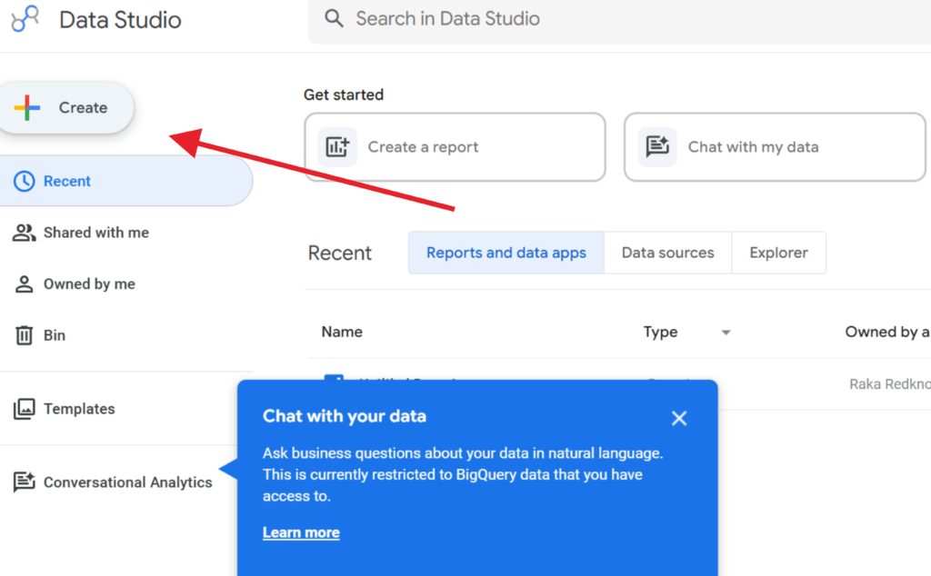
- Go to https://lookerstudio.google.com and sign in with your Google account.
- Click “Create” → “Report”.
- Looker Studio immediately prompts you to add a data source. Click “Add data”.
- Search for “Google Analytics” in the connector list and select it.
- Choose your GA4 Account → Property → and click “Add”. Looker Studio connects instantly.
- To add your Google Sheet as a second source, click “Add data” again from the report canvas.
- Search for “Google Sheets”, select it, and choose your “Weekly KPI Data” sheet.
- Click “Add to report” — both sources are now live and available for use in charts.
Expected result: A blank Looker Studio report canvas connected to two live data sources — GA4 and your Google Sheet — both accessible for chart building and updating automatically as new data arrives.
Step 4: Build Your Dashboard Layout
Why it matters: A well-structured dashboard layout is what turns raw data into information people actually use. The goal is not to show everything — it is to show the right things in the right order so a reader can understand performance status in under 60 seconds.
What to do:
Build a simple three-section layout:
Section 1 — Summary Scorecards (top of page)
- Click “Add a chart” → “Scorecard”
- Add four scorecards in a row: Total Sessions, Total Users, Total Conversions, Cost Per Conversion
- For the last two, use your Google Sheets data source if those metrics come from there
- Set the comparison period to “Previous period” so each card shows week-over-week change automatically
Section 2 — Trend Line (middle of page)
- Click “Add a chart” → “Time Series”
- Set the data source to GA4, dimension to Date, and metric to Sessions
- Set the date range control to “Last 28 days” — this keeps context visible
- Resize the chart to span the full width of the page
Section 3 — Channel Breakdown (bottom of page)
- Click “Add a chart” → “Bar Chart”
- Dimension: Session default channel group (from GA4)
- Metric: Sessions and Conversions side by side
- This shows which channels are driving results at a glance
- Add a Date Range Control to the top of the page so viewers can filter the entire report by custom date ranges without editing the report itself.
Expected result: A clean, professional three-section dashboard showing weekly performance at a glance — scorecards for key metrics, a trend line for the past 28 days, and a channel breakdown bar chart — all pulling from live data.

Step 5: Publish and Share
Your report is now ready to be shared with your team or downloaded for offline use.
Looker Studio makes collaboration simple by allowing you to share interactive dashboards with colleagues, managers, clients, or stakeholders. Anyone with the appropriate permissions can access the latest data and monitor performance in real time.
If you need a static version of the report, you can also export or download it in supported formats for presentations, meetings, or record-keeping purposes.
With your dashboard fully configured, your reporting process is now more efficient, accessible, and easier to manage than traditional manual reporting methods.

Tutorial Video:
In this short tutorial, you’ll learn how to create an automated reporting system using simple and accessible tools.
Instead of manually collecting, organizing, and updating data, you can build a workflow that automatically captures information, stores it in a centralized database, and displays it in a real-time dashboard.
The goal of this tutorial is not only to show the technical steps, but also to demonstrate how automation can help businesses reduce repetitive work, improve reporting accuracy, and provide instant visibility into critical data.
Whether you’re managing sales records, supplier information, customer inquiries, inventory data, or operational reports, the same concept can be adapted to fit your specific business needs.
Watch the tutorial and discover how a few simple tools can transform manual reporting into an efficient, real-time monitoring system.
How Businesses Use AI Reporting Automation
Startups
Early-stage teams use automated dashboards to maintain visibility into key metrics without dedicating headcount to reporting. A founder can set up a single Looker Studio dashboard connecting revenue, acquisition, and product usage data — and receive it automatically each Monday — without hiring a data analyst.
Agencies
Digital agencies use AI reporting automation to deliver client reports automatically at the end of each week or month. Instead of a team member manually assembling performance data for ten clients, a templated Looker Studio report per client pulls live data and is scheduled for automatic delivery — freeing account managers for strategic client conversations rather than data assembly.
Marketing Teams
Marketing teams automate their weekly channel performance reports, campaign dashboards, and monthly board packs using Looker Studio connected to Google Analytics, Google Ads, and social media data sources. The AI narrative step (Zapier + ChatGPT) handles the commentary that used to take 30–45 minutes to write, reducing the full reporting cycle to zero recurring manual effort.
HR Teams
HR departments use automated dashboards to track headcount, turnover rate, time-to-hire, and absenteeism — pulling from their HRIS via Google Sheets or a direct connector. Monthly HR reports for leadership that previously took two days to compile now generate automatically, with AI-written summaries highlighting trends that require attention.
Operations Teams
Operations and supply chain teams use live dashboards to monitor SLA compliance, fulfilment rates, inventory positions, and open ticket counts in real time — rather than waiting for a weekly report that reflects last week’s performance. Workflow automation in operations reporting means issues are visible as they emerge, not after a reporting cycle has passed.
Creators and Solopreneurs
Content creators and independent consultants use automated reporting to track the performance of their content, email lists, and revenue streams without manual data collection. A weekly automated summary of newsletter open rates, YouTube views, and Gumroad revenue takes minutes to set up and runs indefinitely without maintenance.
Enterprise Workflows
Large organizations use enterprise-grade reporting automation — combining Looker Studio, BigQuery, and AI narrative tools — to produce board-level dashboards, regulatory compliance reports, and cross-departmental performance summaries at scale. What previously required a dedicated reporting team of three to five people can be delivered by a combination of automated infrastructure and AI-generated commentary with one analyst overseeing quality.
Best Practices for Automated Reporting
Automate your highest-frequency reports first. The reports produced most often deliver the greatest time savings when automated. A daily or weekly report that takes two hours to produce manually saves 100+ hours per year when automated. Start there, not with the quarterly report that takes a day once every three months.
Connect to live data sources, not exported CSVs. Reports built on manually exported CSV files are not truly automated — they still require someone to export and upload the data. Always connect directly to live data sources (Google Analytics, Google Sheets synced from source, Salesforce connector) so the automation is truly zero-touch.
Keep dashboard layouts simple and consistent. The most effective automated dashboards are the ones stakeholders can read in 60 seconds. Resist the temptation to include every available metric. Five clearly labeled, trend-compared KPIs outperform twenty charts that require careful interpretation every time.
Write AI narrative prompts that specify format and length. Vague prompts produce vague summaries. Tell the AI exactly how many sentences you want, what structure to follow (overall performance, best result, recommendation), and what tone to use. Test with three to four different weeks of data before activating the automation.
Build a testing week before activating scheduled delivery. Before turning on automated email delivery to your full stakeholder list, run the workflow manually for one week and review the output. Confirm the data is accurate, the AI summary makes sense, and the email formatting is correct before it goes to leadership automatically.
Document your automation setup. Automated workflows that only one person understands become single points of failure. Create a simple document (even a Google Doc) describing what each automated report does, which data sources it connects to, and how to update or troubleshoot it. This protects the system when team members change.
Common Mistakes in Report Automation
Automating a broken report. Teams that automate an existing manual report without reviewing its underlying data quality often automate inaccuracies at scale. Before automating, audit the data source — confirm the metrics are correctly defined, the date ranges are appropriate, and the numbers match your source systems.
Building dashboards that nobody looks at. An automated report that arrives in an inbox and gets ignored is no better than no report at all. Before building, confirm with stakeholders what questions they need the report to answer and what format they prefer. Build the dashboard for the reader, not for the builder.
Using too many data sources in a single report. Connecting five or six data sources to a single Looker Studio report creates complexity, increases load time, and makes troubleshooting difficult. Start with one or two sources. Add more only when there is a clear, specific reason.
Not setting up alerts for data source failures. Live data connections occasionally break — a credential expires, a Google Sheet is renamed, an API limit is hit. Without monitoring, a broken connection means the report silently shows stale data or errors — and nobody knows until a stakeholder asks why the numbers look wrong. Set up a simple check: review report output the first time it delivers each week.
Writing AI prompts that assume context the model does not have. ChatGPT does not know what your company’s goals are, what last month’s target was, or what “good” looks like for your business unless you tell it. Include relevant context in your AI narrative prompt — target metrics, comparison benchmarks, or specific things to flag — to produce summaries that are genuinely useful rather than generically descriptive.
FAQ
What is AI reporting automation and how does it work? AI reporting automation is the process of connecting data sources, building reporting logic, and generating reports or dashboards automatically — without manual data collection, formatting, or distribution. At its simplest, it means a live dashboard that updates itself and emails stakeholders on a schedule. At a more advanced level, it includes AI-generated narrative summaries that interpret the data and highlight what matters. The tools range from free (Google Looker Studio) to enterprise platforms (Tableau, Power BI with Copilot).
Which reports are the best candidates for automation? The best reports to automate first are those that are produced most frequently, follow the same structure every time, and pull from data sources that are already in digital systems. Weekly performance reports, monthly KPI dashboards, recurring management summaries, and client reporting are all high-value automation targets. Reports that require significant human judgment or context to interpret — strategic reviews, board discussions — are less suitable for full automation but can still benefit from automated data assembly.
Do I need coding skills to automate business reports? No — for most business reporting use cases, tools like Google Looker Studio, Zapier, and Make require no coding. Looker Studio uses a drag-and-drop interface for chart building and has a point-and-click data source connector. Zapier workflows for AI narrative generation are configured through dropdown menus and text fields. Basic formula knowledge (similar to Excel) is useful for creating custom metrics but is not required to get started.
How accurate are AI-generated report summaries? AI-generated summaries are as accurate as the data they receive and as specific as the prompt they are given. A well-structured prompt with specific data fields and clear instructions consistently produces accurate, useful summaries. The most common accuracy issue is the AI drawing conclusions that require business context it was not given — for example, calling a metric decline “concerning” without knowing it was expected due to seasonal patterns. Reviewing the first four to five AI summaries before activating fully automated delivery helps calibrate the prompt for your specific context.
Can I automate reports from tools other than Google Analytics? Yes. Looker Studio supports direct connections to Facebook Ads, LinkedIn Ads, HubSpot, Salesforce, Shopify, Stripe, and hundreds of other platforms through partner connectors. For tools without a native Looker Studio connector, Zapier or Make can route data into a Google Sheet that Looker Studio reads from. This approach works for virtually any data source that has an API or export capability.
What is the difference between a dashboard and an automated report? A dashboard is a live, interactive view of data that users access on demand — they visit the URL and see current data. An automated report is a scheduled delivery of a data snapshot — sent to stakeholders at a defined time without requiring them to visit anything. Looker Studio supports both: the same report can serve as an always-accessible live dashboard and be scheduled for automatic email delivery. For most business teams, the combination of both — live access plus scheduled delivery — is the most effective approach.
Alternative Reporting Automation Tools
Microsoft Power BI with Copilot
What it does: Microsoft Power BI is an enterprise business intelligence platform that connects to hundreds of data sources, builds interactive dashboards, and — with Power BI Copilot — uses AI to generate report narratives, answer data questions in natural language, and suggest visualizations automatically.
When it’s better: When your organization is standardized on Microsoft 365 and you need enterprise-grade reporting with deep Excel, Teams, and SharePoint integration. Power BI Copilot’s natural language query capability allows non-technical stakeholders to ask questions of their data directly without building new charts.
Who should use it: Enterprise teams, organizations already using Microsoft 365, and businesses that need advanced data modeling, row-level security, and enterprise-grade sharing controls.
Website: https://powerbi.microsoft.com
Tableau with Tableau Pulse (AI)
What it does: Tableau is a leading enterprise data visualization platform. Tableau Pulse uses AI to deliver personalized, automated metric digests to stakeholders — summarizing the metrics most relevant to each user’s role and flagging anomalies in natural language, without requiring them to build or visit a dashboard.
When it’s better: When your organization has complex, multi-dimensional data requiring sophisticated visualization, and you need AI to proactively surface insights to different stakeholders based on their role rather than sending the same report to everyone.
Who should use it: Enterprise analytics teams, data-intensive businesses (retail, finance, healthcare), and organizations that need advanced statistical analysis alongside their dashboards.
Website: https://www.tableau.com
Databox
What it does: Databox is a business analytics platform designed specifically for automated KPI reporting. It connects to 70+ data sources, provides pre-built dashboard templates for common reporting use cases, and sends automated daily or weekly scorecards to stakeholders via email or Slack — making it one of the fastest paths from data connection to automated delivery.
When it’s better: When your team needs automated daily or weekly KPI scorecards delivered to Slack without building dashboards from scratch. Databox’s template library and Slack integration make it particularly fast to deploy for marketing and sales teams that live in Slack.
Who should use it: Startups, agencies, and marketing teams that want rapid automated reporting without the setup investment of Looker Studio or Power BI.
Website: https://databox.com
Notion AI + Zapier
What it does: For teams that already use Notion as their operational hub, combining Notion AI with Zapier creates a lightweight automated reporting workflow — Zapier pulls data from source systems into a Notion database, and Notion AI generates written summaries and highlights within the same workspace where teams do their planning and documentation.
When it’s better: When your team’s primary workspace is Notion and you want reporting that lives alongside your documentation, meeting notes, and project tracking — rather than in a separate analytics tool.
Who should use it: Startups, small teams, and knowledge workers who want automated reporting without adding a dedicated BI tool to their stack.
Website: https://www.notion.so
Key Takeaways
- AI reporting automation replaces the manual data assembly that consumes 3–6 hours per person per week in most business teams — not by changing what gets reported, but by eliminating the human labor of assembling and delivering it.
- Google Looker Studio is the most accessible free tool for building automated dashboards with live data connections and scheduled email delivery — appropriate for teams of any size.
- Adding an AI narrative step (Zapier + ChatGPT) completes the automation by generating written commentary automatically, removing the last manual step in most reporting workflows.
- The highest-ROI automation targets are the reports produced most frequently — daily or weekly — because the time savings compound every single cycle.
- Data quality and source connection reliability are the foundations of trustworthy automated reporting. Automate a clean, correctly connected data source — not a broken manual process.
- A well-built automated reporting workflow requires approximately two hours of setup and zero recurring maintenance — delivering its time savings indefinitely from the day it goes live.
Conclusion
The shift from manual to automated reporting is not a technology project — it is a decision about how your team’s time should be spent. Every hour currently consumed by pulling data, formatting charts, and writing commentary is an hour not spent analyzing what the data means and acting on what it reveals.
AI reporting automation — through tools like Google Looker Studio, Zapier, and ChatGPT — makes this shift accessible to any team, regardless of technical skill or budget. The workflow in this guide — a live dashboard connected to real data, scheduled for automatic delivery, with an AI-generated summary arriving in inboxes every Monday morning — can be built in an afternoon and runs indefinitely without maintenance.
The teams that will lead their industries on data-driven decision-making in 2025 are not the ones with the most data. They are the ones who have removed the friction between their data and the decisions it should inform. Automate reports once, and the insight it generates compounds every single week.
Start with your Monday morning report. Build it once. Set it live. Then move on to the next one.